A brand built on what you believe, not just what you sell
A rebrand is always a question before it is an answer. And the question Boozt Group was asking wasn't simply "how should we look?" — it was "who are we, really?" The answer lived in three words that had long guided the company from the inside: trust, freedom, responsibility.
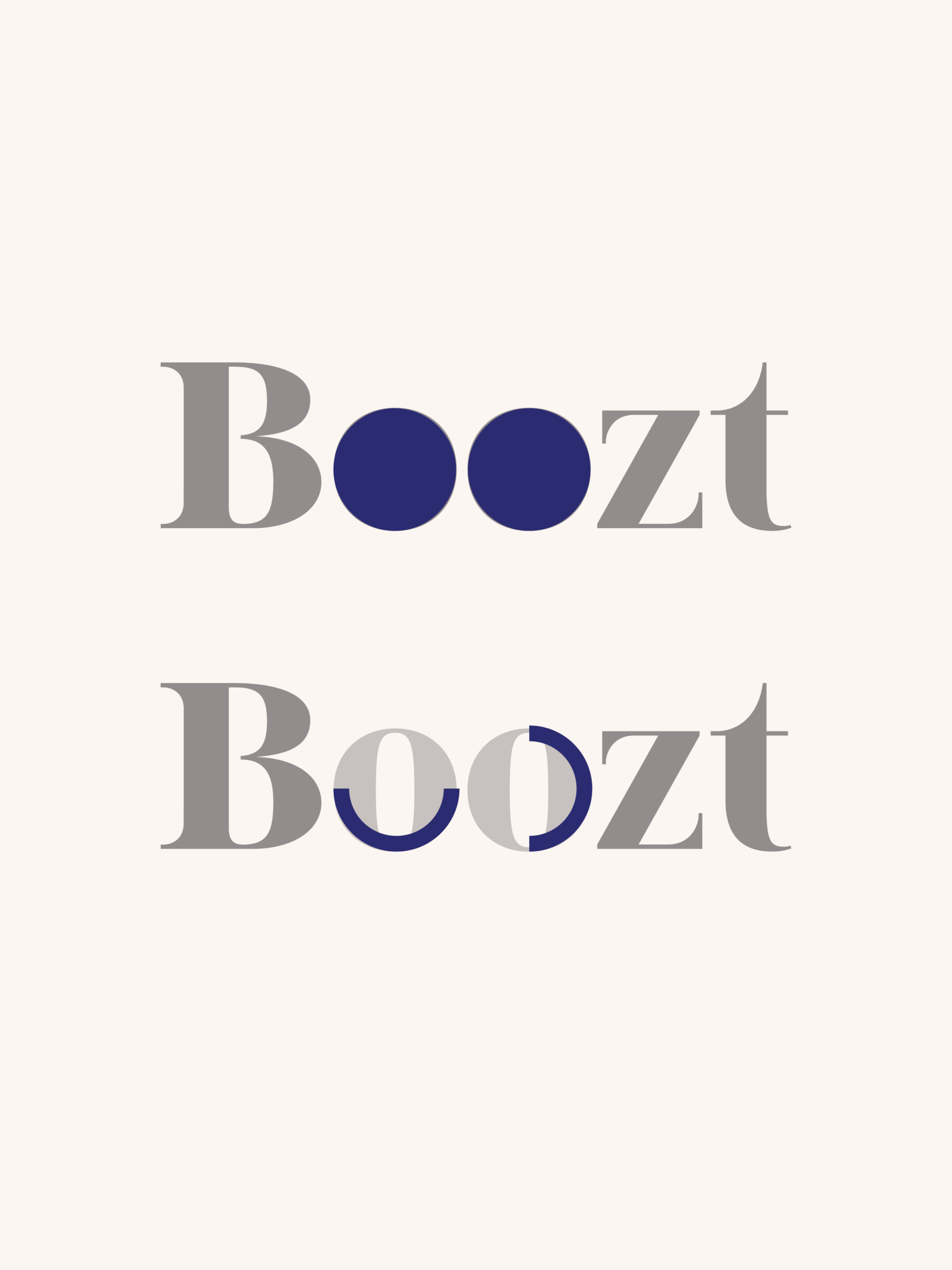
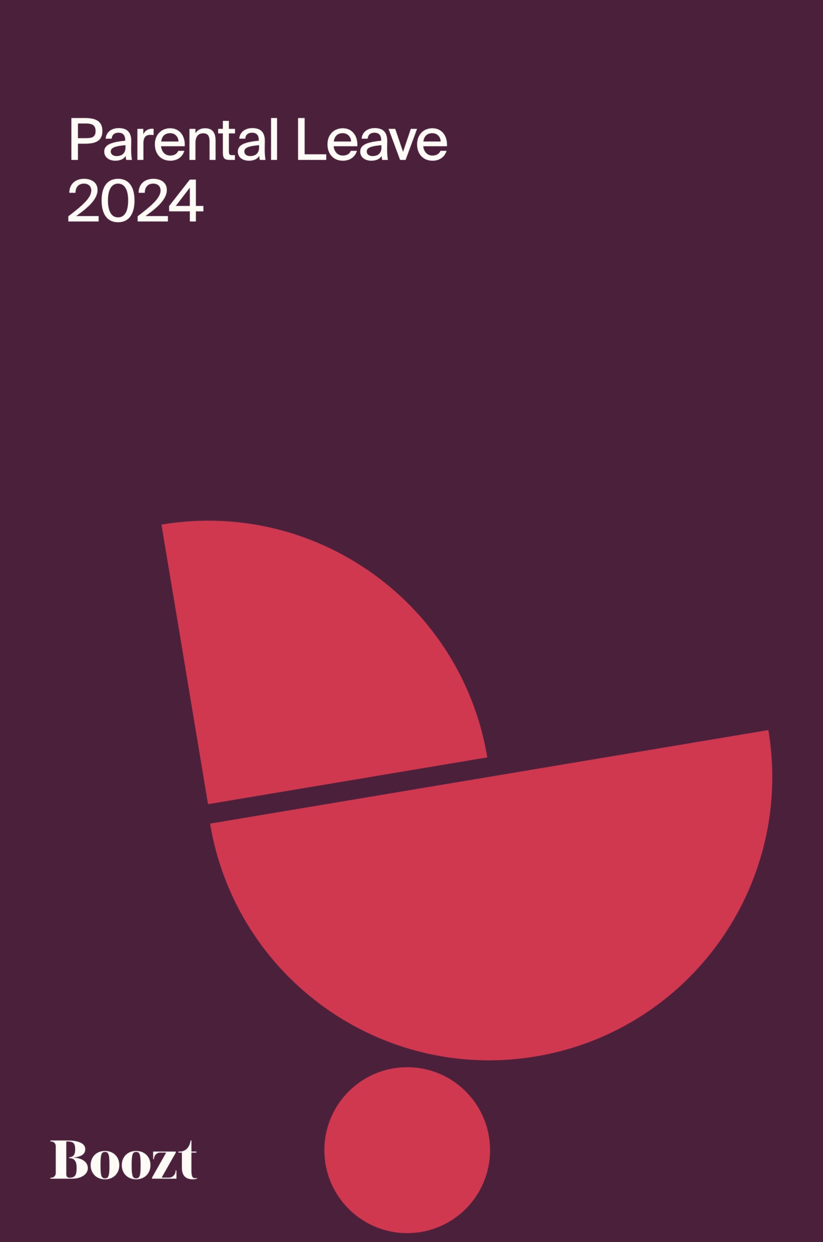
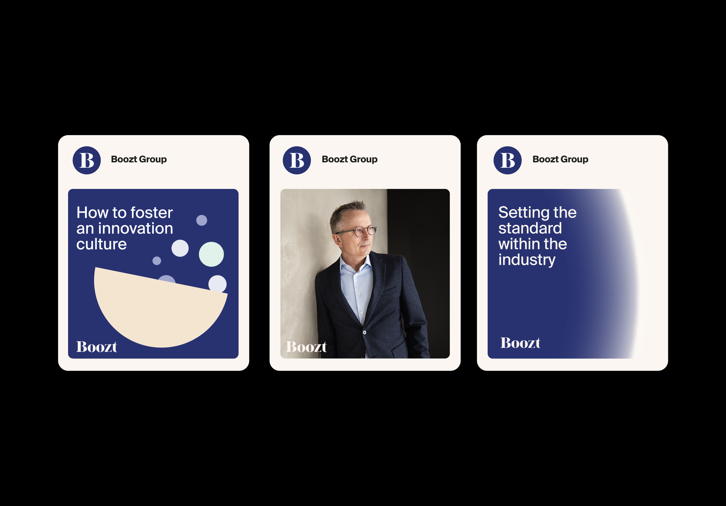
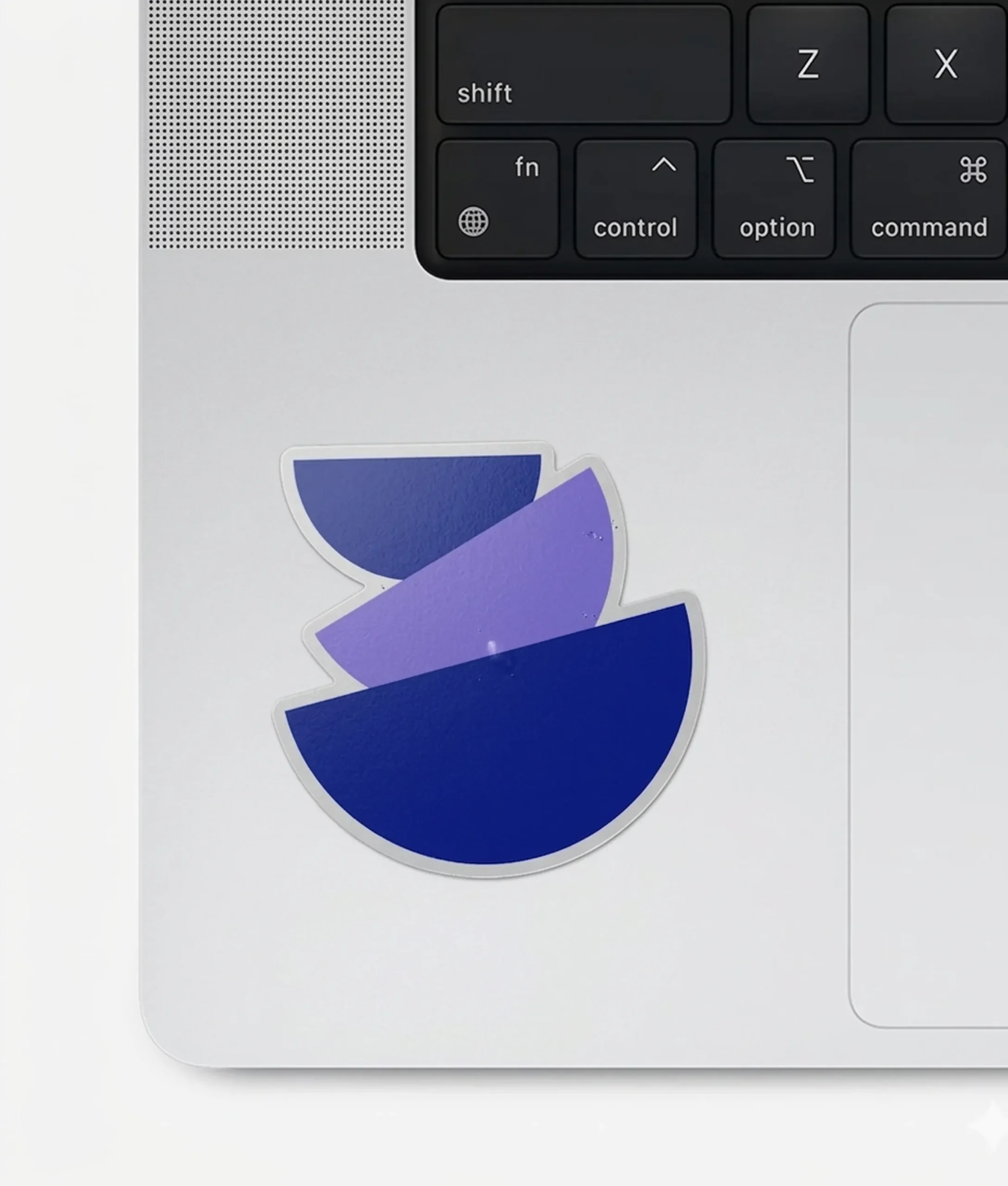
The challenge was to make those words visible. To translate an internal culture into an external language. One that could work across a quarterly report, a social post, a printed booklet without ever losing its integrity. The design system we built doesn't just represent these values; it is structured by them. The circular mark, drawn from the "o" in the Boozt logo, became the cornerstone of everything — a single, simple shape that can stand alone or be broken, combined, stretched, and overlaid into infinite new forms. Stable enough to anchor a brand. Flexible enough to move with it.
Colour was used with conviction, not caution. Typography was given weight and hierarchy. And running through every decision was what CEO Hermann Haraldsson calls the "care-why" — the belief that it's not enough to do something well; you have to understand deeply why it matters. Good design, after all, is good business.
Client Boozt
Art director Caroline Löfgren
Senior Graphic Designer Phillippe Falkesgaard
Senior Communications Manager Rasmus Bruun
Motion Graphic Designer Tom Jordan
Project Leader Emma Anckar
Year 2024


I’d love to hear from you, please get in touch.